以前手がけたお仕事を紹介させていただきます。
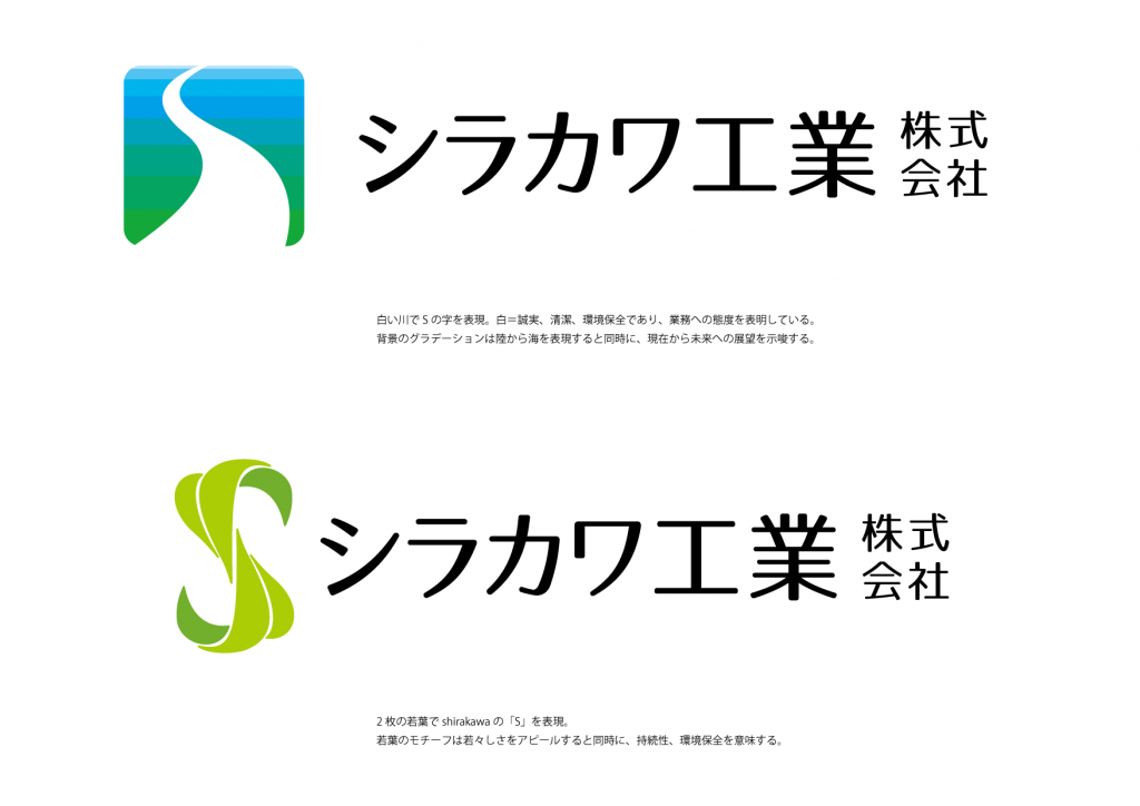
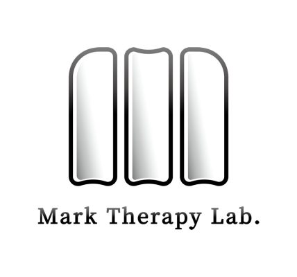
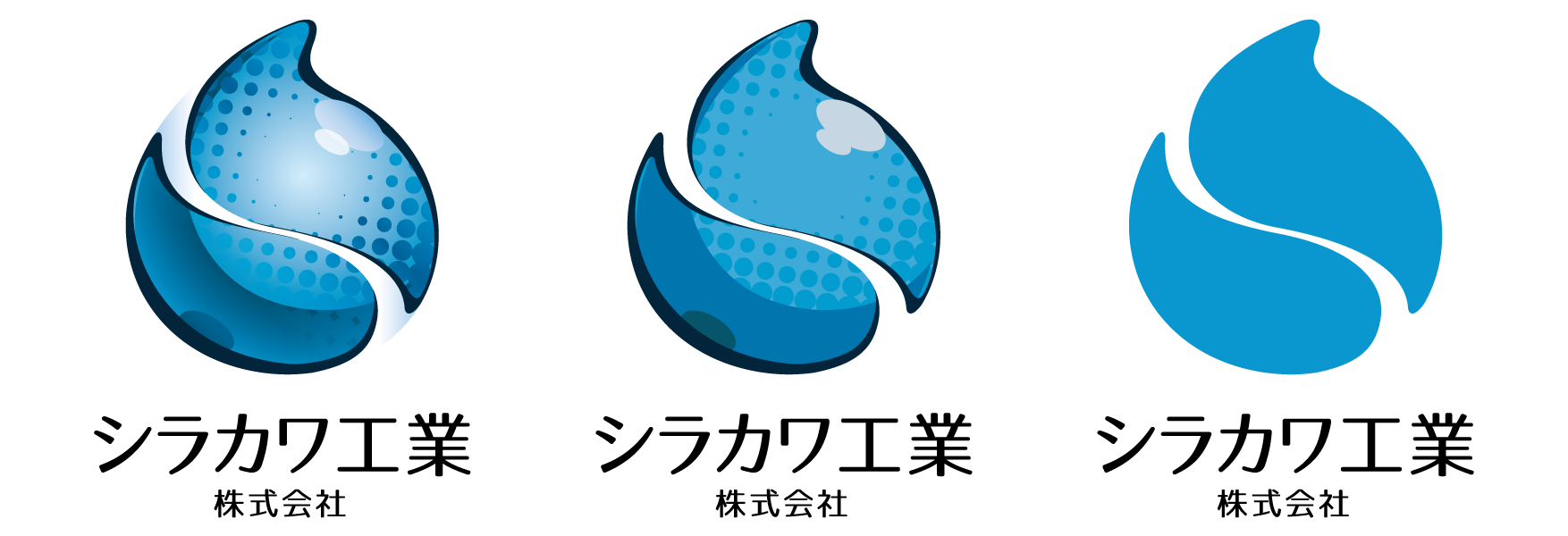
排水設備の施工などを手がけるシラカワ工業株式会社(愛知県名古屋市中村区)のご依頼で、企業ロゴのリニューアルをいたしました。
![](http://fareast-gadget.com/blog/wp-content/uploads/2019/12/f48a21766c3b84a0c8c3c3d9d018db6d-1024x724.png)
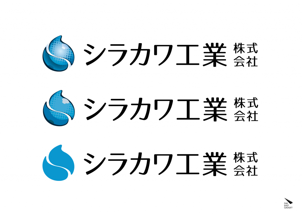
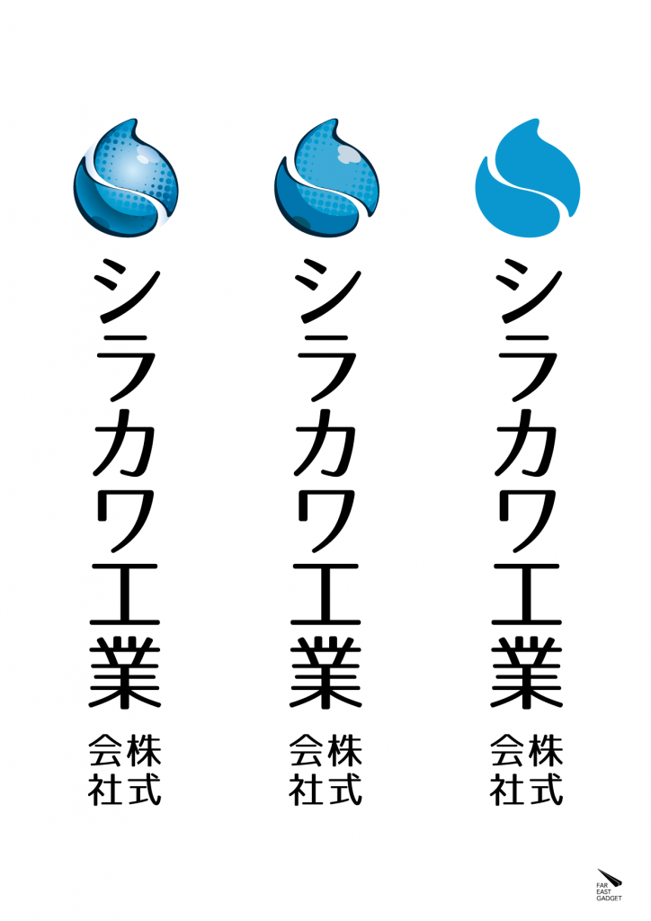
媒体にあわせてフルカラー、ベタ塗り、単色の3デザインを作成
きっかけは経営者の若返り
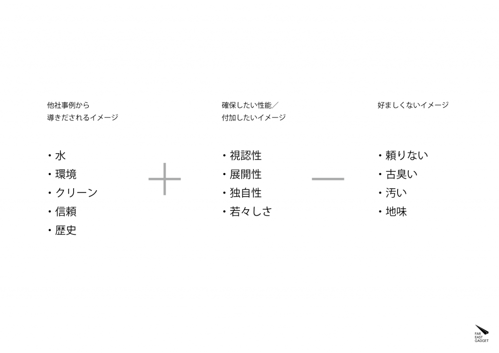
ロゴマークリニューアル依頼のきっかけは、代表取締役が交代し、経営者が若返りしたことでした。現在の業務内容を反映しつつ、現代的なイメージにすることが主題となりました。
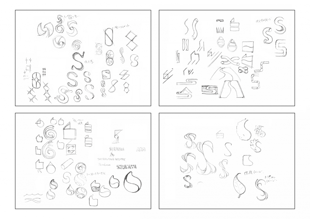
元のシンボルマークは白川の「白」を図案化したものでした。そのイメージを踏襲しながら、新シンボルはshirakawa の「s」のイメージも加え、対外的なわかりやすさを確保しました。
水を扱う企業であることを雫のイメージで表現しつつ 瑞々しさ=若々しさという印象を付加しています。
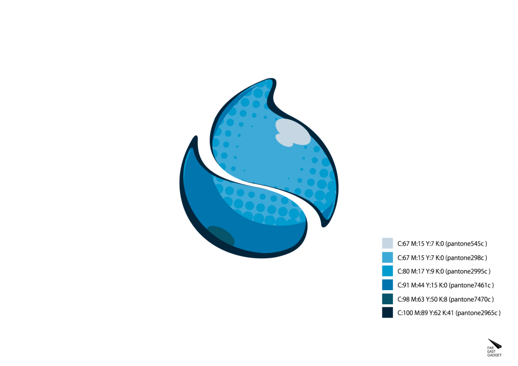
また、企業および業務のイメージアップということもあり、清潔感のあるブルーを基調としました。
![](http://fareast-gadget.com/blog/wp-content/uploads/2020/01/logo_old-1024x768.png)
![](http://fareast-gadget.com/blog/wp-content/uploads/2020/01/243b32885044b3bfc3f6028d25347508-1024x724.png)
![](http://fareast-gadget.com/blog/wp-content/uploads/2020/01/16afe925e9b22fa73afef4cf03d75447-724x1024.png)
![](http://fareast-gadget.com/blog/wp-content/uploads/2020/01/0b41892d5b889af0637b8e7c9add29a9-1024x724.png)
![](http://fareast-gadget.com/blog/wp-content/uploads/2019/12/db6d0a0fe90c0856250ec4d1e514f8b5-1024x724.png)
![](http://fareast-gadget.com/blog/wp-content/uploads/2020/01/72855a6f753d489ee9c5b4e20191250b-1024x724.png)
![](http://fareast-gadget.com/blog/wp-content/uploads/2020/01/idea1-01-1024x724.png)
![](http://fareast-gadget.com/blog/wp-content/uploads/2020/01/idea2-01-1024x724.png)